Field sets are subgroups containing questions on the QI/QI form. Once you create a QA/QI form and add groups, which allow you to organize the information into meaningful sections, you can build out these field sets.
To add a field set in a QA/QI form
-
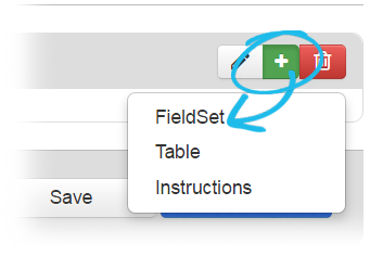
After you create a QA/QI form and a primary group, from the QI/QI form building page, click the add icon associated with the group you want to add the field set to and select FieldSet.
-
In the Edit FieldSet window, for Label, enter a name for the subgoup.
-
Click Save.
To associate questions with a field set
-
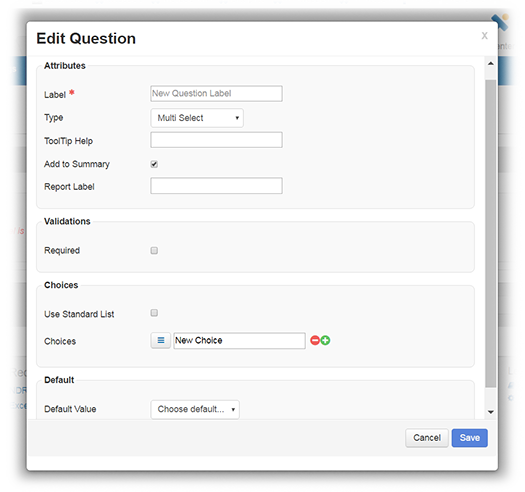
From the QI/QI form building page, click the add icon associated with the field set you just created. The Edit Question window opens.
-
In the Attributes section, complete the fields as applicable. The following are the fields common to most or all types of questions.
Field
Description
Label
Text of the question that appears to the individual filling out the form.
Type
The type of field you want to add to the questionnaire. Depending on what you select, additional fields may appear on the form configuration page. For example, if you specify Numeric, you must also specify the type of number the user can enter for this question.
Refer also to Type-specific Fields.
ToolTip Help
Specifies a brief description, definition, or instruction for the field.
If you specify text here, the Help icon appears next to the field. The user can view the definition or description by hovering over the icon.
Add to Summary
Specifies that the question and answer are to appear in the form's notification summary. When the form is completed and submitted, this summary appears to the recipient in the Completed Forms notification window.
Note: In some cases, you may want the form summary to include a question only when the answer is Yes. Set up a check box question in the form and add only the Yes option to it. If the user completing the form selects Yes (as well as the Add to Summary check box), the question appears in the form summary. If the user does not select Yes, the question does not appear in the summary.
-
In the Validations section, complete the fields as applicable. The following are the fields common to most or all types of questions.
Field
Description
Required
When selected, the user completing the form must provide an answer to this question before they can submit the form. The asterisk icon appears next to the field, as does the word "Required."
Available for the following types: Text, Numeric, Date, Text Area, Selection List, Table Row, and Column.
Min Length
Enforces the minimum length of the input.
Max Length
Enforces the maximum length of the input.
-
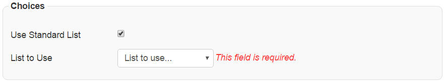
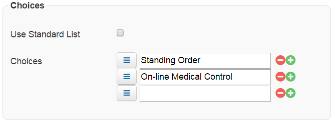
In the Choices section, available if you chose Multi Select for the question Type, use a standard list or create one.
-
To use a standard list, select Use Standard List. For List to Use, select the most appropriate option.
-
To create custom options, clear Use Standard List. For Choices, enter the text to appear as an option for selection. Click the green plus icon to add options. If needed, to delete an option, click the red minus icon. Add as many options as appropriate for the list.
-
-
In the Default section, for Default Value, enter or select a default value for the question, if appropriate.
-
Click Save.
Type-specific Fields
The following table lists and describes the fields you can configure. The fields available depend on the question Type you select.
|
Type |
Description |
Unique Fields |
|---|---|---|
|
Single Line Text |
Answer can consist of a single line of text. |
|
|
Multi-Line Text |
Answer can consist of multiple lines of text. |
|
|
Numeric |
Answer must be numeric and comply with the other attributes specified. |
|
|
Date/Time |
Answer must be a date, time, or date and time combination that complies with the other attributes specified. |
|
|
Checkbox |
Answer options from which the user can choose are presented as check boxes. The user can select more than one check box. |
|
|
Radio Button |
Answer options from which the user can choose are presented as radio buttons. The user can select one option. |
|
|
Single Select |
Answer options are presented in a drop-down list from which the user can select one option. |
|